Aggregate Supply and Demand
The quantity theory can be shown graphically in terms of the aggregate-supply aggregate-demand framework that has become popular in macroeconomic textbooks. Aggregate demand is the amount people will spend, or money multiplied by velocity. If money is 30 and velocity is 7, total spending will be 210. Total spending of 210 can be divided between prices and quantities in a number of ways. If the price level (P) is 1, quantity (Q) will be 210. If P is 2, Q will be 105, if P is 3, Q will be 70, if P is 5, Q will be 42, etc. When graphed with axes of price level and transactions, aggregate demand has the form of a rectangular hyperbola.1 This aggregate-demand curve is shown below as the MV curve.
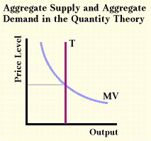
The quantity theory assumes that transactions are determined outside the model by the availability of resources and by technology. Because it assumes there are no adjustment problems, the aggregate supply curve is the vertical line shown in the graph above as the T curve. At each price level the same quantity is available, or price level does not influence quantity supplied. The price level is determined by the intersection of these two curves. If the amount of money increases, the aggregate demand curve shifts to the right. Since transactions are fixed, the end result must be an increase in price level.
Notice that aggregate-supply and aggregate-demand curves are describing what happens in the market for goods and services, not in the market for money balances. If there is a disturbance in the money market, that disturbance is transmitted to the goods-and-services market via the aggregate-demand curve. The quantity theory encourages us to see a purchase of goods as a sale of money, and a sale of goods as a purchase of money. Changes in the resource market are transferred to the goods-and-services market via the aggregate supply curve. The quantity theory does not see the market for goods and services as the place disturbances begin. What we see happening in this part of the economy is the result of events in other sectors.
Although simple, this model helps make sense of a number of historical events. For example, U. S. economic growth in the late 19th century, spurred by increases in resources and improving technology, was faster than the growth in money stock. From the graph above we should expect that the period had deflation, and in fact the deflation of this period dominated political debate.
The quantity theory of money gives us one view of aggregate supply and aggregate demand. Other macroeconomic theories will give us somewhat different views of aggregate supply and aggregate demand. We will see some of these different views in upcoming chapters.
An examination of commodity monies helps explain the quantity theory.
   
1 A property of this curve is that all rectangles formed using the origin and a position on the curve as corners and the axis for sides will have the same area.
Copyright Robert Schenk
|