Recent Fonts
from Ingrimayne Type
|
|
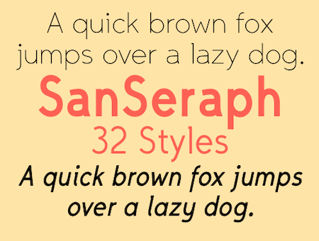
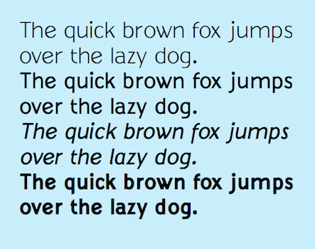
SanSeraph is a simple, clean, sans-serif font family that is highly legible and useful for both text and some display purposes. It is not meant to stand out but to blend in and let the reader focus on the meaning of the text rather than the look of the text. The family has 32 styles composed of three widths, two with five weights and the third with six, and each of these 16 has an italics style.)
released April 2024
|
|
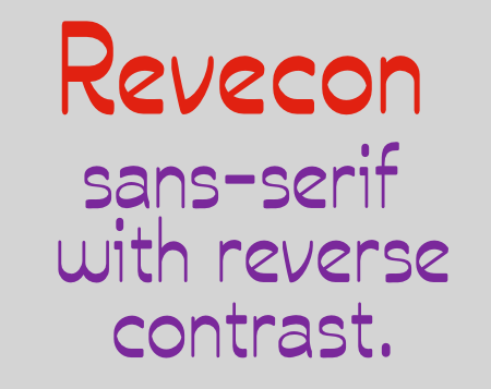
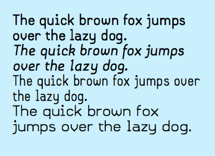
Revecon is an unusual new sans-serif typeface family from Ingrimayne Type that has reverse contrast (sometimes called inverse contrast), that is, the letters are thick where normally they are thin and vice versa. Serif fonts with reverse contrast were popular in the 19th century for advertising and display purposes. As a result these fonts have an old-fashioned or wild-west look. San-serif fonts with reverse contrast have an uncommon look that is quirky and modernistic. Revecon is legible but seems inappropriate for lengthy text. It can be useful for display purposes such as advertising and similar uses where one wants something simple but a bit unusual and odd.
released February 2024
|
|
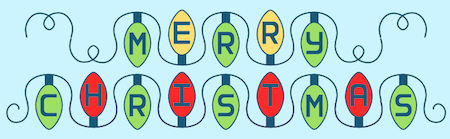
It struck me in early December 2023 that my typeface Vinetters, which puts letters on alternating leaves, could be reworked to make a font of Christmas lights with alternating letters. I initially thought the name Christmas Lights would be appropriate but found that name was taken by a typeface that seemed to have little to do with either Christmas or lights. The name DecorateTheTree both captures a Christmas theme and is weird enough so others have not used it for a typeface.
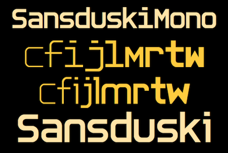
DecorateTheTree is a festive novelty font family that is useful to display a holiday message not just in words but in the lettering itself. The family has two styles, a regular style with clear bulbs and the bold style with filled bulbs. They are designed to be used in layers. Further, the fonts use the OpenType feature contextual alternatives to alternate two sets of letters, one set with bulbs standing up and the other set with the bulbs hanging down. The end result gives the impression of a string of Christmas lights. (The characters on the bulbs are derived from the font SansduskiMono.)
released December 2023
|
TR>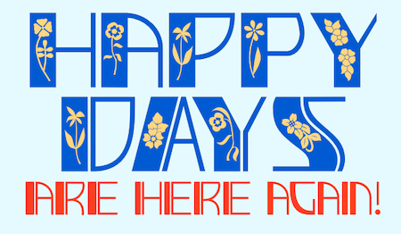
|
DecoSpring is a decorative art-deco family that was inspired by one word in an advertisement in a 1978 edition of my local newspaper. I could not find a typeface that matched it so decided to create one, which became DecoSpring-Regular. It is caps only, with an alternative set of capitals on the lower-case keys. Characters with very thick stems invite interior decoration and I opted for floral decorations. DecoSpring-Flowers can be used alone or it can be layered on top of the regular style to create colored flowers. Changing the width of the bolder stem resulted in two more style, the light and thing styles. Another set of four styles, the Simple set, was formed by eliminating the split in the stems by merging the two parts. All the DecoSpring faces are display faces to be used in small doses, and especially the bolder ones, at large point sizes.
released April 2023
|
TR>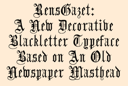
|
RensGazet is a decorative blackletter typeface with elaborate upper-case letters and condensed lower-case characters. It was inspired by the masthead of a short-lived weekly newspaper, The Rensselaer Gazette, which was published from 1857 until 1860. I could not find any existing digitized fonts that replicated this old typeface, so I decided to create an interpretation of it. I had samples of few letters in large point sizes and a number of others at a small point size, though these were blurry and not sharply defined. As a result, this typeface is undoubtedly considerably different from the original. Also, my spacing is much tighter than that in the source samples.
released March 2023
|
TR>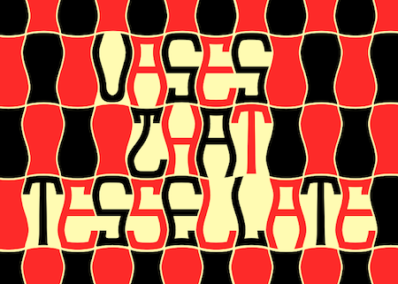
|
Vasetters is a novelty font in which the letters are cut from the shape of a tessellating vase. To get the tessellating effect, the two sets of letters (and numbers and some symbols) must alternate, and this is done automatically in applications that support the OpenType feature of Contextual Alternatives (calt). Vasetters is monospaced and comes in two weights. The regular weight is tightly spaced, which should not be a problem at large point sizes. At small point sizes adjacent letters can be colored differently or the character spacing can be increased. The lighter weight can be used alone or layered above the regular weight to create the effect of hollow lettering. Vasetters is fun, bizarre, weird, and obviously a decorative display font.
released February 2023
|
TR>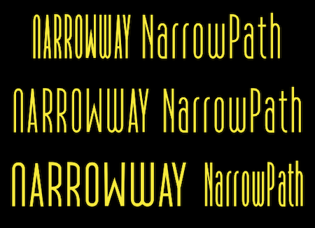
|
NarrowWay and Narrow Path are two condensed fonts. Each has three widths: ultracondensed, condensed, and regular, but even the regular is very condensed. Each width has three weights and each of these nine styles has an oblique version. NarrowWay does not have a lower-case but has mostly alternate forms where the lower cans should be. NarrowPath has a true lower case. They are the most condensed fonts in the Ingrimayne Type library.
released December 2022
|
TR>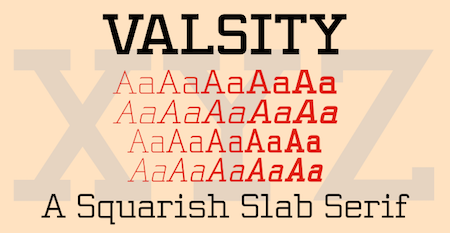
|
Valsity is a squarish slab-serif family with five weights and two widths, each with an italics for a total of twenty members. With negligible contrast, it is almost monoline. It is for decorative uses; it is too square and lacks the contrast to make it a good choice for extensive text. Valsity began with a blending of two other squarish slab-serifs, Valgal and Kwersity, and its name reflects that ancestry. From there it took on a life of its own, often diverging from its parents.
released September 2022
|
TR>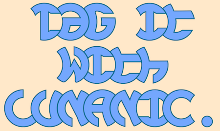
|
Lunanic is a geometric novelty typeface family with a touch of graffiti. The letters are formed from a circle with a notch or nick taken out, a shape that reminds me of a partial lunar eclipse. Half of the family have the nick on the left and half on the right. The faces are monospaced and there is no space between most of the letters so the filled styles cannot be used alone without tweaking. There are several ways to tweak them to make them readable: adjacent letters can be colored differently, the characters spacing can be increased, or an outlined style can be layered on top of the filled letters. The family does not have a true lower case. Most of the characters in the lower-case slots are alternates for those on the upper-case keys and they can be mixed in whatever way the user finds best. The family has twelve members: two orientations with three weights each and each of these six has an outline style to go with it.
released August 2022
|

|
Complements is another alternating-letter typeface in which lower-case characters are designed to alternate with upper-case characters. It comes in two styles, a regular and an outline style, with the outline style designed to be used in a layer above the regular style. The typeface is monospaced.
released July 2022
|
|
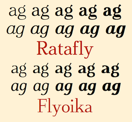
One of the advantages of having a large library of fonts is that they can be blended to produce new and often interesting new fonts. Sometimes the blend is more useful than the parents. About half of the text fonts in the IngrimayneType library are the results of blending. In 2022 two more blended families joined the library. Ratafly originated in a blending of two very different families, Rataczak and FlyHigh. Flyoika is the offspring of two families with a lot of similarities, FlyHigh and Euroika. Both are versatile, useable for either text or display. Each comes in five weights with matching italics.
released June and July 2022
|
|
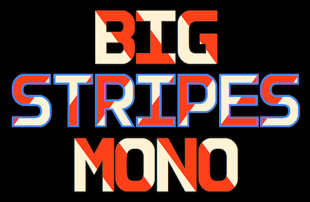
In designing BigStripesMono, I created a bold, sans-serif face that was all caps. I thought the face had possibilities as a decorative face without stripes, so I added a lower case and then created ten weights with matching obliques. I thought the face would also be nice with proportional letters, so I added another family of twenty faces. Both families are better suited for display than for text.
released April 2022
|
|
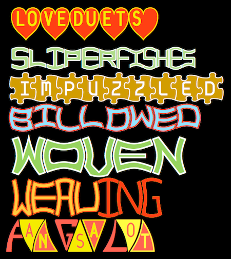
Seven More Alternating-Character Typefaces
As 2022 began I continued trying to fill a lightly populated niche in typefaces: typefaces with alternating letter sets.
LoveDuets alternates letters on the left half of a heart with letters on the right half. The family has two styles.
SlipperyFishes has a wave both on top and bottom and the wave reflects rather than parallels. It comes in four styles.
IMPuzzled puts letters on tessellating puzzle pieces. It has two styles.
Billowed and Woven form letters from the template of distorted squares that tessellate. Billowed has four styles and Woven two.
Weaving condenses Woven and loses the tessellation properties. Weaving has three styles.
FangsALot is based on a tooth or fang shape and uses this shape in two very different ways. The family has nine styles.
released January-March 2022
|
|
BigStripesMono is a family of four fonts designed to allow candy-cane lettering. Unlike other striped lettering, the stripes of this family are not obvious on a single letter. Rather two or more of the family members must be layered and arranged properly for the stripes to appear. It is another family from IngrimayneType designed to utilize the power of contextual alternatives.
released December 2021
|
|
Five More Alternating-Letter Families
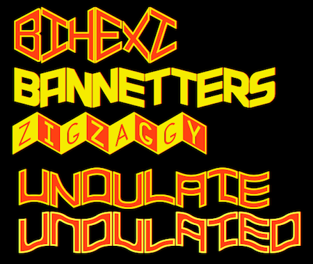
Bihext alternates letter sets based on a bisected hexagon. It comes in two styles, a filled and an outlined style.
The letters of Bannetters are formed on parallelograms, one set sloping downward to the right and the other sloping upward to the right. Alternating the two sets results in a zigzaggy string of words. Bannetters has two styles, one with squared edges and the other that rounds the outside of letters that are usually curved.
Zigzaggy has letters on diamond-shaped parallelograms that are formed by trisecting a regular hexagon. It comes in four styles.
In Undulate one set of letters bulges upward and the other sets bulges downward. The result is wavy text or text that resembles a washboard road. It has a solid and an outlined style.
Undulated is also wavy but the peaks and valleys of the waves are at the right and left sides of the letters rather than in the middle as in Undulate. It seems to have a more chaotic appearance than Undulate, perhaps because its letters lack the symmetry that some of the letters in Undulate have.
released Oct/Nov 2021
|
|
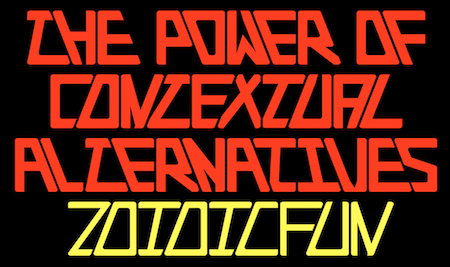
ZoidicFun is a family of ten fonts in five weights. Each member is designed to alternate upper-case and lower-case letters using the OpenType feature of contextual alternatives (calt). The letters are based on asymmetric trapezoids and they fit very closely together. This distinctive and visually-arresting family can be used for titles or advertising.
released September 2021
|
|
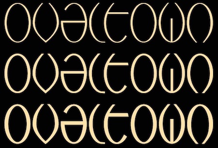
Ovaltown is a geometric font family with three weights in which the letters are derived from ovals or ellipses. It does not have true lower-case letters but many of the characters in the lower-case slots differ from the corresponding characters in the upper-case slots. Ovaltown is strange, unusual, and bizarre and can be useful when one wants strange, unusual, and bizarre lettering.
released August 2021
|
|
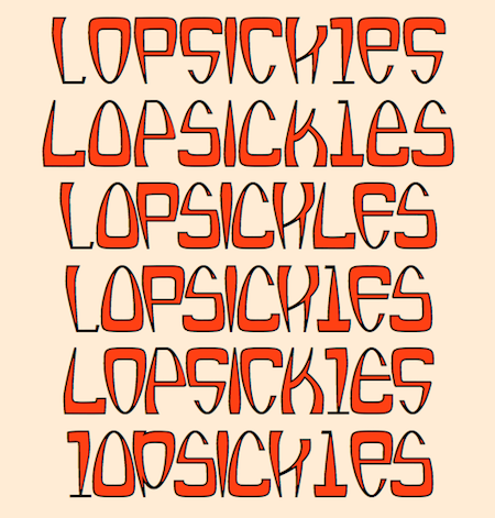
Lopsickles is a strange family of twelve fonts, most of which use the OpenType feature of contextual alternatives to alternate characters. The letter shapes are based on a lopsided and distorted ellipse. The stroke varies, being heavier at the end that is wider. As a result, some letters are bottom heavy and some top heavy. The family has four sets of letters that are arranged to form six basic fonts, four of which are designed to alterate characters. Each of the six basic fonts has an inset style that can be overlaid to add color or to create the effect of outlined letters. The inset styles are not designed to be used alone but only in layers. Lopsickles joins several other alternating-characters families in the IngrimayneType library including Snuggels (May 2020), CloseTogether (December 2020), and Caltic (April 2020), but is visually very different from them.
released August 2021
|
|
JetJane is a geometric sans faces that is plain, unadorned, and highly legible. The family has two widths and each width has nine weights. Each of these 18 fonts comes with an accompanying italics version, giving the family a total of 36 members. It is derived from JetJaneMono, a monospaced sans-serif face.
released July 2021
|
|
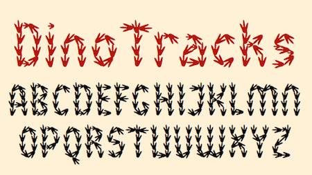
Over the years I have designed a number of letterbat fonts, fonts in which the letters are made up of objects such as feet, hands, safety pins, pipes, and bugs. In 2012 I tried to make one from dinosaur tracks but abandoned it because it just did not work.
Recently I published a maze book with a maze that had walls made of dinosaur footprints. To make this maze, I elongated the footprints from the unsuccessful font. I then realized that the narrower footprints would make much better letters than my attempt in 2012. The end result was DinoTracks.
DinoTracks is readable at small point sizes, though at small sizes seeing that the letters are made of footprints is difficult.
released May 2021
|
|
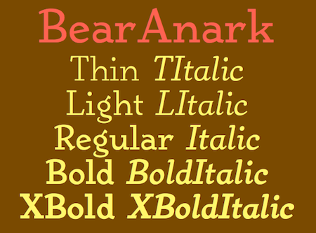
BearAnark is a decorative slab-serifed typeface that can be used for some text purposes. It has moderate contrast and comes in five weights, each with a true italic. The development of the family began with a blending of two other slab-serif faces, Anarckhie and BearButteT, and this origin is reflected in its name.
released March 2021
|
|
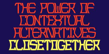
CloseTogether was designed to alternate convex and concave letter sets, with convex letters on the upper-case keys and concave shapes on the lower-case keys. The OpenType feature of contextual alternatives (calt) does this automatically. Individually some of the letter shapes are strange and unsightly. They have the shapes that they have so that they fit snuggly with adjacent letters. The family has three weights: regular, bold, and extrabold. The letter spacing is set very tight and the user may want to loosen it by altering characters spacing.
released December 2020
|
|
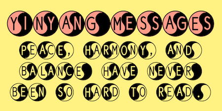
YinYangMessages contains two sets of letters, those on the upper-case keys that fit on the left side of a yin-yang symbol and those on the lower-case keys that fit on the left side of a yin-yang symbol. The OpenType contextual alternatives feature will alternate the sets automatically in any program that supports this feature. The family contains two fonts. In one the filled half is on the left and in the other the filled half is on the right. YinYangMessages is a fun and playful family that every once in a while may be the ideal typeface for some unusual situation.
released December 2020
|
|
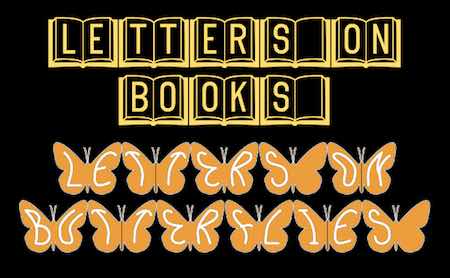
These two typeface families use the Opentype feature of contextual alternatives to alternate two sets of characters. Earlier in 2020 I designed several other typeface using this feature, but they alternated sets of characters that fit together such as convex and concave blocks. In these new faces the alternating sets are two sides of a symmetrical object, in one case open books and the other butterfly wings. I am unaware of anyone else who has done typefaces similar to these.
released December 2020
|
|
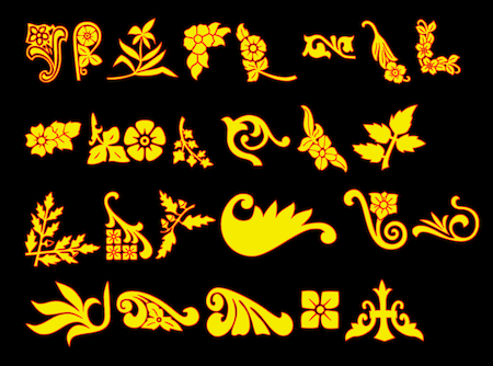
Ckornoments is a picture font of corner ornaments. It includes 23 designs each in four orientations so it can be used to decorate the four corners of a page or poster. Some of the designs also work well as section dividers. The Ckornoments family includes an outline style that was designed to be used in layers with the regular style, though each can be used alone. Ornaments that have flowers have be decomposed so that with layers they can be rendered as bicolored (or tricolored with the outline style) pictures.
released October 2020
|
|
Kwalett is a legible sans-serif family with ten members, five weights each with an italics style. The family is derived from the thinnest member of the Qualettee family. As members of Qualettee get bolder, their contrast increases. As members of the Kwalett family get bolder, their contrast remains very low. Kwalett is designed to work better as text than the Qualettee family.
released August 2020
|
|
Samsheriff is a legible sans-serif family with three widths. Each width has five weights. Italics double the styles to a total of 30. Samsheriff does not fit any category of sans serif but has an eclectic mix of letter styles. Like Zimric, it is descended from the lettering used in Coffinated.
released June 2020
|
|
Zimric took the letters from Coffinated and reworked them, adding a lower case, additional widths and weights, and italic styles to generate a family of 28 styles. It has the appearance of neat, legible lettering.
released May 2020
|
|
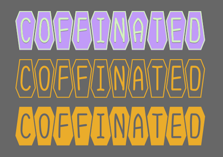
Coffinated features letters on coffins. It is monospaced and its two styles can be used in layers for added color. The letters placed on the coffins were specifically designed for this font family.
released May 2020
|
|
Go to previous releases
Back to
Index
|