(available at myfonts.com and fonts.com)
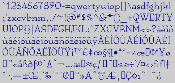
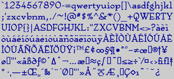
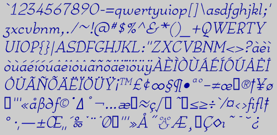
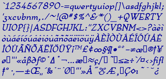
Periodically I try my hand at a text face. Some of the very good text faces are done by long-time professionals or by teams and take thousands of hours to complete. I have not done anything that challenges the quality of some of those faces, but it is still an interesting personal challenge to produce something that will work well as a text face.
Anarckhie is a square-serifed typeface in which the horizontal elements of the upper-case letters are below their midpoint, and the x-height of the lower-case letters is unusually small. There is some variation in the weights of the horizontal, vertical, and diagonal elements. The small x-height makes this typeface appear smaller than its point size would indicate, so text set in 12-point Anarckhie will appear much smaller than text set in 12-point BetterTypeRight. If you find it a little too unusual to use for straight text, consider it for text that needs a decorative touch.