(available at myfonts.com and fonts.com)
Every so often I try my hand at a text face. Some of the very good text faces are done by long-time professionals or by teams and take thousands of hours to complete. I have not done anything that challenges the quality of some of those faces, but it is still an interesting personal challenge to produce something that will work well as a text face.
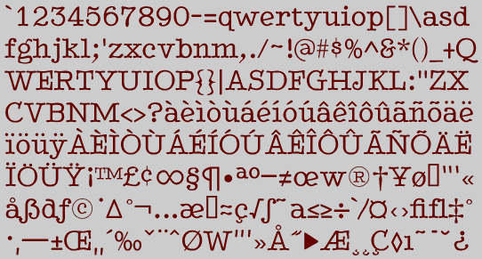
BetterTypeRight is an semi-formal (or semi-informal) text face with large serifs. It has some variation between horizontal and diagonal elements, but not a great deal, and it has a very high x-height. It has the feel of a typewriter typeface, but it is not monospaced.
This face works well as a text face in informal places, that is, in places where you want something a bit more elegant than a typewriter face but not quite as formal as traditional book faces.
In addition to the standard family members of plain, bold, italic, and bolditalic, BetterTypeRight has several other members. There are thinner versions of both the book and italic styles, and a medium version of the book style. This medium version was the first completed, but was a bit too heavy for normal text use. The Plain and Bold versions were derived from it. Finally, there are special variants in plain and bold weights. The special styles have swash caps on the upper-case keys and small caps on the lower case keys.