(available at myfonts.com)
The ten chess fonts on the No-Hype Type CD make give it one of the largest variety of chess fonts that is available.
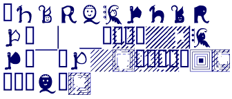
PawnShop is a frivolous set where I tried to construct each piece both as a picture and a letter. Thus the pawn is both a p and a foot soldier with a back pack. It was fun to do. (This is from a guy who likes doing novelty fonts--and Pawn shop is a novelty chess font.)
SeederChessSmall is a set that actually resembles a chess set. SeederChess is a variation on SeederChessSmall. The pieces are a little bigger, and there are some other subtle changes. I prefer this one to its earlier version, but I did not have the heart to throw away the earlier one.
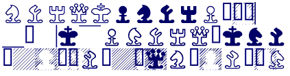
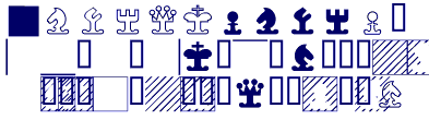
All the chess typefaces have a similar structure. The order of pieces is pawn, knight, bishop, rook, queen, and king. White pieces are on keys 0,1,2,3,4,5 and black pieces are on pieces 6,7,8,9,(semicolon),(colon). Sometimes an alternative set of white pieces are on the keys !"#$%&. (Pawn=!, knight=", etc.) Some typefaces have alternative knights and bishops. The alternative black pieces will be (). The alternative white knights will be ?@ and the alternative white bishops will be NO.
The empty white piece is on key B and the empty black space is on key A. To get a pawn on a black space, one must type in a C and then the key for the pawn. The black spaces for the knight through king are D through H. If one uses an alternative knight, the black background is <. If one uses an alternative bishop, the black background is K.
There are alternative shadings for the black squares in some fonts. The first alternative will be on Q (black space), R (white space), S through X (backgrounds for knight through king). Alternative knight and bishops backgrounds will be = and L. A second alternative, if it exists, will be on keys d through k, with the same structure as the keys Q through X or A through H. (There are a lot of possibilities, but they come at the cost of complexity. The benefit is that one font can hold a dozen different looks.)
Finally, to put a border around the chess board, use t for the top, l for the left, right for the right, and b for the bottom.