(The font is currently retired.)
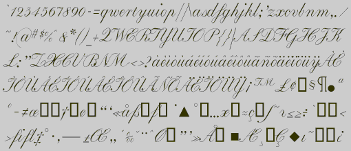
When a formal script is drawn by hand, the calligrapher must make the downstroke heavy and and the upstroke light and must give the letters a pronounced rightward slant. EdwardEdwin-Plain a is fairly simple version of this style, with little ornamentation.
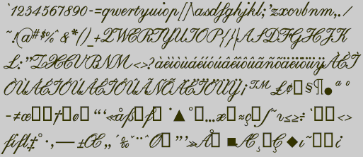
I found this a challenging typeface to draw because many of the letter shapes are not intuitive and look strange in isolation. I relied heavily on the guidelines in several books which explain how to draw this style with a pen. The bold style is not only heavier than the plain style, but has less variation between the thin and thick elements.
There are a large number of formal scripts available in PostScript format. Every major type foundry has several. Some are better drawn than EdwardEdwin, but none will match the output of a truly skilled calligrapher because a calligrapher can adjust the connections between letters in ways a typeface cannot.
Formal scripts are used for documents such as invitations and for a variety of display situations. At small point sizes this style of type is difficult to read.
Go to Medieval and Calligraphic
2
Back to E Fonts