(available at myfonts.com and fonts.com)
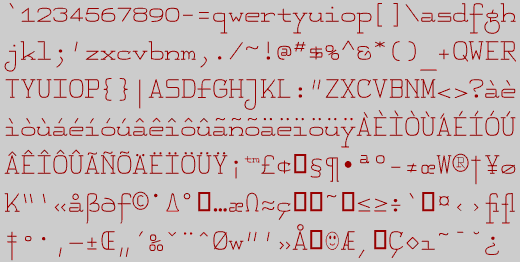
It is easy to dislike monospaced typefaces. Because they force all letters to have the same width, they are inevitably ugly (though we have gotten so used to them we usually do not notice this ugliness). However, they pose an interesting challenge to the type designer. How does one design a face so that the m and w are no wider than the i? With FeggoliteMono, I set out to design a monospaced font with had a very small x-height and long descenders. I know of no typewriter with such a face, but if there were one, perhaps it might resemble this unusual construction. Consider it when you want an unusual but decorative touch.
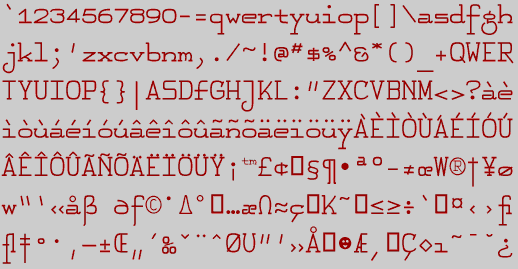
FeggoliteHatched was derived from FeggoliteMono using a program called Incubator Pro 2.0 (published by Type Solutions). The hatched version has a higher x-height than the original which means the ascenders (on letters such as b, h, and k) and descenders (on letters such as j, p and q) are shorter. There is also contrast between the vertical and horizontal elements. Also, several of the letters have been redesigned. The typeface is still monospaced, but the letters are now skewed or slanted to the left. (Everyone should have a few typefaces with this characteristic.) If you would like to have this typeface in an upright version, try italicizing it in your word-processors Style Menu.
Incubator Pro takes an existing typeface and lets the user change some of its characteristics. Unfortunately, to get the altered typeface into usable form usually requires that one use another typeface program to get into the typeface and fix up some of the characters. This cleaning up of the letters is not trivial, but takes hours of work. If Incubator Pro produced cleaner results, you would undoubtedly see a great many "hatched" versions of typefaces in this collection.
Go to Monospaced Fonts
Go to F Fonts