(available at myfonts.com and fonts.com)
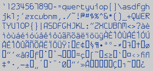
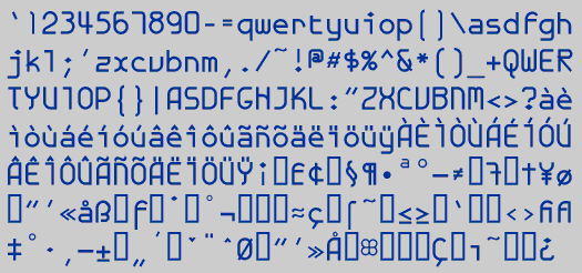
GalexicaMono was an attempt to create a futuristic typewriter font, which may be an oxymoron. I thought the design had more possibilities, so I continued to develop it as a proportional font, which you can see in Galexica. It is quite readable at small point sizes, but there are enough oddities in its letter shapes so that it is best used not as text but as a display face.
Go to Monospaced Fonts
Back to G Fonts