(available at myfonts.com and fonts.com)
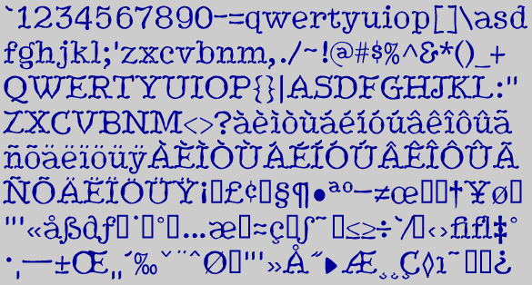
HippityDippity has squiggly serifs and no straight lines or smooth circles. Looking like it has smoked something strange, it comes in two weights and an inline variation
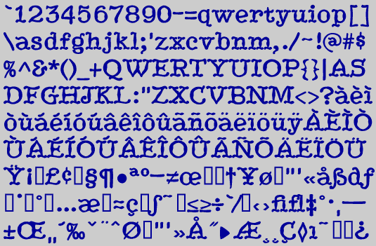
The text font BetterTypeWrite was based on the basic shapes and sizes of the letters of HippityDippity. Usually I design the simple font first and then move to the more complex, but not always.
Go to Display Fonts 1
Go to H Fonts