(available at myfonts.com and fonts.com)
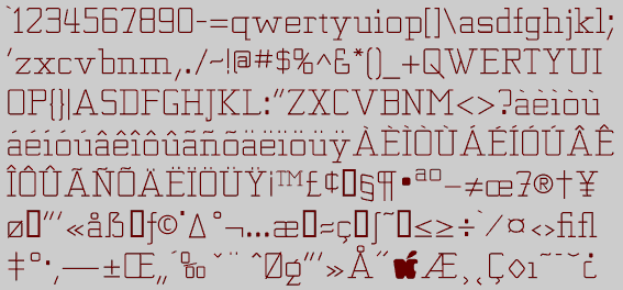
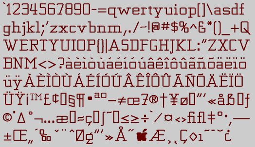
A great many of my typefaces come from playing with previous designs. One way I often do this is to make a typeface more readable, more like a text face. Looking at Kwersity, a geometric, serifed typeface with strokes of uniform weight, I wondered what it would look like if it were a bit wider, with a somewhat smaller x-height. KwersityWider is the result. Though it is more text-like than Kwersity, it still is basically a display face.
Go to Display Fonts 1
Go to K Fonts