(available at myfonts.com and fonts.com)
When printing first developed, the first typefaces attempted to replicate the hand-lettered look of medieval manuscripts. Most countries quickly moved away to a Roman look, except Germany, which kept the old hand-lettered look until the 20th century. (Hitler at first embraced it as Germanic, and then later forbade it as Jewish.) The standard style for books and newspapers was Fraktur, and many variants of it existed, just a many variants of the Roman alphabet exist.
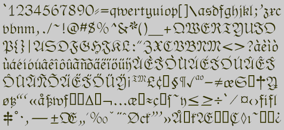
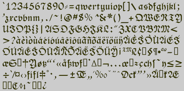
Fraktur is hardly used at all today, and in Germany it is used only for decorative purposes. This is unfortunate, because it is a beautiful type style. The No-Hype Type CD has an unusually rich collection of fonts based on the Fraktur style.
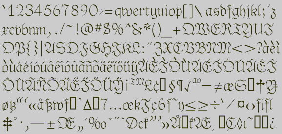
PhederFract is not the recreation of any existing version of Fraktur, but an attempt to do a Fraktur face as a calligraphic face. Buried in the typeface are some of the peculiarly German letter forms.
Go to Medieval and Calligraphic
1
Go to P Fonts