(available at myfonts.com and fonts.com)
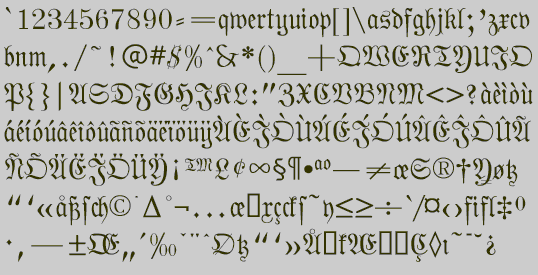
When printing first developed, the first typefaces attempted to replicate the hand-lettered look of medieval manuscripts. Most countries quickly moved away to a Roman look, except Germany, which kept the old hand-lettered look until the 20th century. (Hitler at first embraced it as Germanic, and then later forbade it as Jewish.) The standard style for books and newspapers was Fraktur, and many variants of it existed, just a many variants of the Roman alphabet exist.
Fraktur is hardly used at all today, and in Germany it is used only for decorative purposes. This is unfortunate, because it is a beautiful type style. The No-Hype Type CD has an unusually rich collection of fonts based on the Fraktur style.
I learned to read Fraktur when I studied German in high school and college. However, I did not become interested in doing a version of it until I found some old German-language periodicals dating from the 1870s in a trash heap. Phraxtured is a fairly accurate rendition of the letter forms used in that publication. However, several characters in fraktur, such as the k, y, x, and S, look bizarre to English-language readers, and I have created more comfortable alternatives. Fraktur also has two variants of the letters "s", which English also had until the nineteenth century. (I have included the old-style "s" in a number of the typefaces on the No-Hype Type CD, usually where the integral sign should be.)
Go to Medieval and Calligraphic
1
Go to P Fonts