(available at myfonts.com and fonts.com)
It is easy to dislike monospaced typefaces. Because they force all letters to have the same width, they are inevitably ugly (though we have gotten so used to them we usually do not notice this ugliness). However, they pose an interesting challenge to the type designer. How does one design a face so that the m and w are no wider than the i?
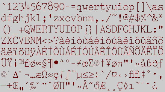
TiredOfCourier is a typeface I constructed for Font Pro Vol 2, published by the now-deceased company Wayzata Technology. Because it emulates a typewriter, it is monospaced, which means that all the characters have the same width. Courier is by the far the most popular typewriter face. It was developed for the electric typewriters in the 1950s and is built into most laser printers. TiredOfCourier was meant as an alternative, with a look which is reminiscent of the older, manual typewriters.
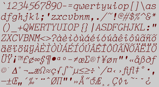
While preparing the second font CD I designed, Font Pro 3, I read selections from Burnham's Celestial Handbook, the Bible of amateur astronomers. This book is typeset in a monospaced, typewriter-looking typeface, but it uses a true italics. Because I found this effect appealing, I decided to add italics to TiredOfCourier.
The addition of the italics significantly increases the usefulness and attractiveness of this typeface family. It may even give people a reason to use it instead of Courier, which does not have a true italics in the versions I have seen.
Go to Monospaced Fonts
Go to T Fonts