![]()
![]()
![]()
Indifference Curves
Economists write the notion that using goods and services helps people achieve goals (attain utility) as a mathematical function, or
U = f( x1, x2, . . . xn)
One can represent this equation with a table that gives a "map" of consumer preferences. However, there are two problems with tables of this sort. First, they assume an independence between goods that seems unlikely. The added utility of a shirt depends only on the number of previous shirts that have been bought, and not at all on the number of hamburgers. If shirts and hamburgers are either substitutes or complements, this independence should not exist. However, tables can easily be made that will avoid this problem.
The second problem is more serious and has led economists to avoid tables (except for explanatory purposes) when discussing utility theory. A table with numbers to represent utility assumes that utility can be measured. Because utility refers to the extent that goals are accomplished, there is no way of knowing whether any measurement is arbitrary or not. This problem can be overcome by using graphs or mathematics.
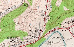
At first glance, using a graph instead of a table may not seem like a good way to proceed. Discussion of maximizing utility must involve at least three variables: the amount of good A, the amount of good B, and the level of utility. Graphs have only two axes, and three variables seem to require a three-dimensional construction rather than a two-dimensional one. However, there is a way around this problem, one that geographers use when they draw contour maps showing the three variables of longitude, latitude, and altitude. They show altitude with a series of lines or topographic contours such as those in the map below, which shows a hilly section of West Virginia.
The same method of construction can be used to show a utility map. A line will connect all possible combinations of good A and good B that show the same level of utility. This line is called an isoutility (iso is Greek and means "the same" or "equal") line or, more commonly, an indifference curve. In general, these isoutility lines will be curved, as in the graph below, if diminishing returns hold.
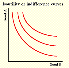
One does not need to measure utility in order to draw a graph such as that in the graph above. All one needs is the ability to order different levels of utility; that is, to say that bundle A is preferred to bundle B, or that bundle B is preferred to bundle A, or that the chooser is indifferent between the two bundles.
Indifference curves assume that individuals are consistent. If Jane prefers option A to option B, and if she also prefers option B to option C, then she should prefer option A to option C. People with inconsistent behavior will not attain their goals as well as they could, and if behavior is too inconsistent, their behavior may show few regularities or predictable patterns.
Next we see how demand curves come out of indifference curves and budget lines.
Copyright Robert Schenk