We all have heroes and people we admire. As a typographer I admire those who can create beautiful and clever typefaces. There is also a person in the type business, let's call him Joe, who I admire for a rather perverse reason. He has been able to take crap (and this is not too strong a word) and sell it, making bushels of money. In contrast, I have a collection of decent typefaces and have sold only a tiny fraction of what Joe has been able to sell. I do not resent him for that; on the contrary, I admire him for it. I cannot imitate most of the things he does, nor do I want to, but I have tried to learn a thing or two from him.
I first came into contact with Joe's work when I got a printout of his font CD. Looking through it, I found that he had used several of my shareware fonts in his CD, but he had taken them much further than I would ever have dared to go. One of the fonts he had used was RedLetter, which is made up of hammers and sickles. I released an early version of RedLetter as demo-ware because I could not imagine anyone having much use for it, though it was a clever design. (Recently I found it used on a music CD--so someone found a use for it.) Joe had taken RedLetter, skewed to the right and to the left, and had formed a hollow version of it. He had done the same with every other font he had"borrowed" from the shareware and freeware offerings, thereby turning every font into four fonts. These transformations are very easy to do in Fontographer, but they are not normally done because the results are not of any use. But it does produce numbers, and numbers sell type CDs at the low end.
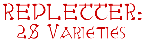
However, Joe had done much more with RedLetter. He had put it through a font distortion program called Font-O-Matic, and had produced six variations of it. Then each of those variations was slanted right and left, and hollowed. The end result was 28 different fonts all generated from my original typeface, RedLetter, a typeface I had released as shareware because I did not think that anyone would find it very useful. Can you see why I admire Joe? He was able to produce a font CD that claimed to have 2000 fonts by taking slightly more than 100 shareware and freeware fonts and distorting in all sorts of ways. And people bought it!!!
In the summer of 1995 I had an opportunity to create my third font CD, an opportunity which was to end painfully for me, but I did not know it at the time. I decided to take some pages from Joe's book and see what I could do with Font-O-Matic, a font distortion program which is no longer being sold. I figured that since I had designed a couple hundred typefaces, some of them should give me interesting results if fed into Font-O-Matic. And though I quickly discarded most of what Font-O-Matic produced, I found that sometimes it gave interesting and even useful results. But you can judge for yourself as I show you how to play the numbers game, though I am an amateur compared to people like Joe.
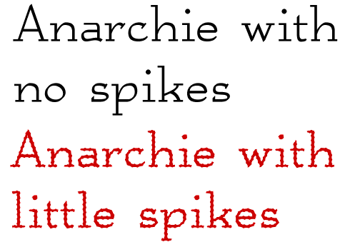
Anarchie is a semi-calligraphic, serifed font that has a unique look, as well as a full family of plain, italic, bold, and bolditalic. Using the cactus effect of Font-O-Matic produced a rougher version of the font that has a wrought-iron look. The cactus effect was the easiest to use of Font-O-Matic effects because the output usually was acceptable without a lot of effort needed to clean it up. It also led to some really weird results when applied to hollow fonts, as the picture below shows:

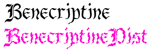
So everyone should have a spiky font or two. But how many does a person really need? Probably a lot fewer then the ten or twelve I have completed. And they easily slip into questionable taste, as I think the example below illustrates:
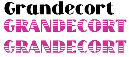
Several of the Font-O-Matic effects are easily done in Fontographer, such as scaling, skewing, rotating, and changing weights. Several other effects are completely or almost useless. I was never able to get anything interesting from the bite effect, which is suppose to take bites out of letters. Two that are almost as useless as bite are cow-spotting and Swiss cheese. Here is what Swiss cheese produces on my font Grandecort-Bold, a decorative sans-serif font:

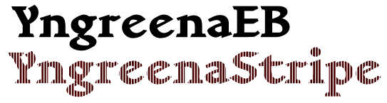
I cannot show you the cow spotted effect because they are all in storage (though there are some on a Polish-language localization of my type library.)
There were other effects which looked promising, but when actually tried did not work out so well. I did one 3-D effect, but it took so long to clean the results in Fontographer, and this from a font with very simple outlines, that I never attempted a second.
The college effect, which put a halo around the letters, also looked promising until one actually got the output. It took so much work cleaning up the little problems that it was easier to do the whole procedure in Fontographer.
The warp effect was interesting, but 99 percent of all output was garbage. Here is an example of the one percent where the warped typeface seemed to me to be worth keeping:
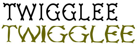
Twigglee is a typeface that was inspired by the handwritten captions on pictures in an old book.
This sample gives you a glimpse of a serious problem with the warp effect. It tends to leave letters with different weights, and it took forever to go in and clean up the results in an effort to get something presentable. (The G is too thin relative to the I. Of course, it is a distorted font, so some difference in weights is OK.)
Here is another warped font that I liked:

The top typeface is not warped; it was designed that way. Notice that the two Cs are different. One is upper case and the other lower case. Warping a typeface that had a rather warped appearance to begin with seemed to work out just fine.
More promising was an effect called Wave. Here it is applied to a wild calligraphic font. When printed, the results look like old printing that has decayed with time:
Below is a tighter wave effect in KampFriendship, a serifed font that could be handwritten. When used on typefaces that were had a constant stroke, and which were not not very complex, the results were often pleasingly bizarre (as opposed to awful bizarre).

You can see other wave effects on the page that displays novelty fonts.
The effect that I got the most mileage from, though, was the stripe effect. At first I did not realize the possibilities, so did things like this:
But if one used Fontographer first to prepare the font to be striped, and then came back later and used it to adjust the output, one could build interior stripes:

or to go back to Grandecort, which was filled with holes in a previous example, but which is now has attractive stripes and a cool color:
But getting interior stripes was not automatic effect, and Font-O-Matic was sold as a stand-alone product, not as a supplement to Fontographer. As a stand-alone it was a disaster. With a couple of rare exceptions, I only got acceptable results when I went back and tweaked the output in Fontographer.
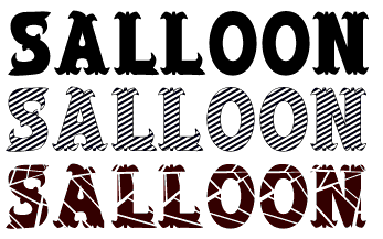
Finally, here is Salloon, a striped version, and finally a cracked version. Fat fonts were much better suited to alteration by Font-O-Matic than were thin fonts, and it was very difficult to do much at all with novelty fonts or calligraphic fonts. And that brings us back to those 28 variations on RedLetter. That is an amazing accomplishment, in the same league as a .400 batting average in baseball or a 60 point game in the NBA. Can you see now why I admire Joe?
I have tried to use Font-O-Matic with some constraint, and I think I have gotten as much mileage from it as I can get. I found that diminishing returns set in fairly early, and that with time, it became increasingly difficult to find ways of distorting my fonts that led to results I liked. After all, how many cracked or spiked fonts does anyone really need? Somewhere between ten and twelve percent of the more than 500 typefaces I have constructed have been done with some help from Font-O-Matic. The number is closer to twelve percent for the Polish localization of my type library, and closer to ten percent for the standard version. I believe that my position was special because I had such a large library of type to play with. But I must admit that I was motivated by numbers, just like Joe. I wanted to complete enough typefaces for that third CD, and Font-O-Matic helped me get there.
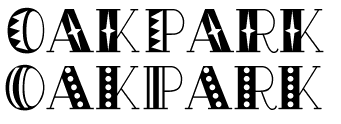
Finally, I do not want to leave the impression that there are not many other ways to create strange decorations within fonts. Here are two fonts that have interior decoration created without any resort to a font distortion program.
(I might add that this little excursion was intended not only to show you Font-O-Matic results, but it also provided a way to illustrate a number of typefaces I did not know how to otherwise put into a narrative.)
As for the CD I was working on, it was finished and published as Font Pro 5, Fun Type by Wayzata Technology. But within months of publication, the company which was distributing it went out of business, selling their inventory at a dollar or two a CD. I ended up being paid $250 for a summer's work, but I now have full rights to the fonts I created. If you would like to know more about these fonts or my business misfortunes, feel free to e-mail me.