When I discovered that there were two megabytes of free space waiting for me to fill up at www.geocities.com, I began to put together pages illustrating type. (I no longer update that site, and all of the good stuff is now here at ingrimayne.saintjoe.edu.) I soon encountered difficulties in getting some of the things done that I wanted to do because I have a very limited software budget, and I do not buy things unless I absolutely need it.
To make type appear decent on screen, one needs to anti-alias it, a process of taking away the "jaggies." Here is a sample of text (the font is called BetterTypeRight) at 72 point as it normally appears on my computer screen:
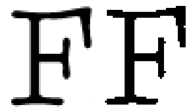
Anti-aliasing puts in grays, giving the impression of a much more detailed. (Some of printers will do the same thing with text, by the way, although it is less of an issue now that 600 dpi is about as low as resolution gets on modern printers.) Anti-aliasing can be done by printing the text in memory at a larger size, and then reducing it to normal. Suppose, for example, we initially print the image four times as large and then reduce it to one fourth this initial size. If all four dots that are to be reduced to one are black, they stay black. If, however, one is white and three are black, then a deep shade of gray will be used. If only one is black and three are white, then a light shade of gray is used. The end result is the image below, which I am sure you can tell looks much better.
If we enlarge the Fs above, we can see the grays more clearly. The image on the left is an enlarged view of an anti-aliased F, while that on the right is an enlarged view of an F which is not anti-aliased.
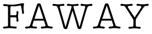
However, there is another problem with the text above, which is that it is not spaced right. Some letters pairs need special treatment to make large text look correct. For example, the letters A and V together will normally be too far apart. They can be tucked together and will look much better. This process is called kerning, and if we take the letters used above use the information on kerning pairs built into the font, we get this:
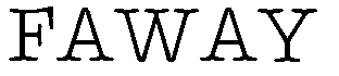
which is much different from the unkerned spacing:
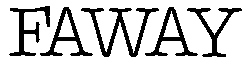
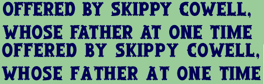
For a long time I did not have software that would both kern and anti-alias, so I chose that which would anti-alias. For my "Old West" style fonts this caused serious problems because they need to be kerned to look decent. In March of 1998 I downloaded a public beta of Fireworks by Macromedia which both kerned and antialiased. You should be able to see the results below, where two of the lines are not kerned and two use the kerning info in the typeface. If you cannot see the difference, you can go through life happy as a typographical illiterate.
Back to the story.
Back to index.