(available at myfonts.com)
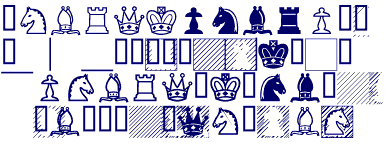
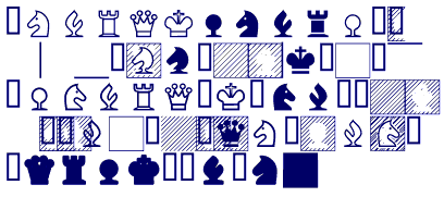
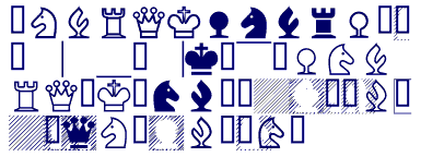
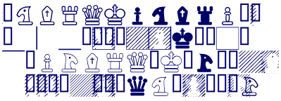
The ten chess fonts on the No-Hype Type CD make give it one of the largest variety of chess fonts that is available.
BobsStandardChess is a design that is supposed to give a rather standard chess board. After I had designed several chess sets, I decided to do some research. I looked at all the chess books in the two local libraries, and found seven or eight different chess designs. But about four of those designs were very similar, and only close examination showed the differences. BobsStandardChess is meant to look very much like all those very similar boards.
ChessNut is a modernistic chess set derived from SeederChess. It has nice clean lines.
ChessNutTwo is a variation of ChessNut. The sizes of the pieces has been increased, and the black square has a finer grid. ChessNutTwo probably will work better at small sizes than ChessNut.
The first chess set I designed was called Chessterton. I wanted to do one based on simple shapes. Most of the pieces were put together from rounded rectangles. It is an interesting design, but perhaps a bit too offbeat to be very useful. ChesstertonTwo changed the location of pieces to match the locations in the other chess fonts.
All the chess typefaces have a similar structure. The order of pieces is pawn, knight, bishop, rook, queen, and king. White pieces are on keys 0,1,2,3,4,5 and black pieces are on pieces 6,7,8,9,(semicolon),(colon). Sometimes an alternative set of white pieces are on the keys !"#$%&. (Pawn=!, knight=", etc.) Some typefaces have alternative knights and bishops. The alternative black pieces will be (). The alternative white knights will be ?@ and the alternative white bishops will be NO.
The empty white piece is on key B and the empty black space is on key A. To get a pawn on a black space, one must type in a C and then the key for the pawn. The black spaces for the knight through king are D through H. If one uses an alternative knight, the black background is <. If one uses an alternative bishop, the black background is K.
There are alternative shadings for the black squares in some fonts. The first alternative will be on Q (black space), R (white space), S through X (backgrounds for knight through king). Alternative knight and bishops backgrounds will be = and L. A second alternative, if it exists, will be on keys d through k, with the same structure as the keys Q through X or A through H. (There are a lot of possibilities, but they come at the cost of complexity. The benefit is that one font can hold a dozen different looks.)
Finally, to put a border around the chess board, use t for the top, l for the left, right for the right, and b for the bottom.