(available at myfonts.com and fonts.com)
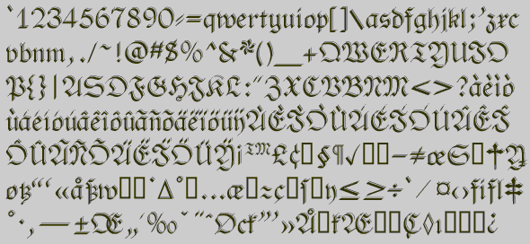
When printing first developed, the first typefaces attempted to replicate the hand-lettered look of medieval manuscripts. Most countries quickly moved away to a Roman look, except Germany, which kept the old hand-lettered look until the 20th century. (Hitler at first embraced it as Germanic, and then later forbade it as Jewish.) The standard style for books and newspapers was Fraktur, and many variants of it existed, just a many variants of the Roman alphabet exist.
Fraktur is hardly used at all today, and in Germany it is used only for decorative purposes. This is unfortunate, because it is a beautiful type style. The No-Hype Type CD has an unusually rich collection of fonts based on the Fraktur style.
PhederFrack-Shadowed gives PhederFract a decorative line-shadow placed to the right and above the characters. (The other face shadowed in a similar manner, NeuAltisch, is also a Germanic, Fractur face, but it has the line-shadow to the right and below the characters.) Typefaces in this medieval, semi-calligraphic style often are decorated with additional detail; it is part of the history of the style. To see the detail in the letters of PhederFrack-Shadowed, it must be used at larger sizes, in excess of 36 point.
Go to Medieval and Calligraphic
1
Go to P Fonts