Back to part one of the proposal
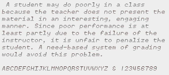
Old dot matrix printers were usually monospaced, and sometimes the ribbons would wear unevenly, so that the tops of the letters would be darker or lighter than the bottoms. IrritationOne lets one relive those old days of horrible dot-matrix printers on a modern laser or ink-jet printer.
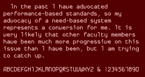
GalexicaMono is an attempt to construct a modernistic monospaced fonts. That may be an oxymoron, but it was an interesting project. This is the bold version of the font. Unlike JetJane and TiredOfCourier, it has no italics, though it does have some non-proportional variations.
If a modernistic monospaced font was a challenge, how much more challenging would a decorative monospaced font be? I tried one with a font called Feggolite, which comes in plain and bold. The above font, FeggoliteHatched, is a variation created with a font distortion program called Incubator. It increased the x-height, and then gave it a backward slant.
Some fonts are fertile, in that they give rise to lots of interesting variations. Others are sterile, in that there is very little one can do with them. Feggolite was moderately fertile. Use of the font distortion program "Font-O-Matic," (which I believe is out of print) led to FeggoliteRuffled. Think of it as a grunge font--which are all the rage these days--and maybe that will give you a more benign view of it.
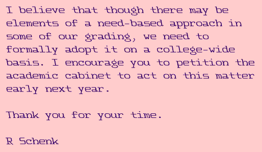
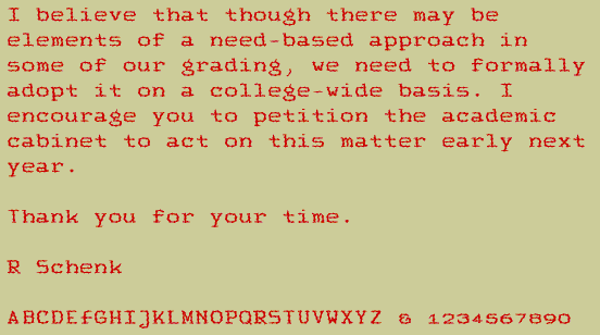
If you have actually read the memo that has been used as the text for these samples, I hope I have convinced you that the grading system of America needs to be reformed. Join the revolution and try to get need-based grading adopted in your schools. ;-)